

From UI toolkit to Design System
Company
Devex
Role
Lead Designer
Duration
2023 - 2025
Project overview
Soon after joining Devex, we designers saw a clear consistency issue. By working in separate squads different UIs for the same elements had been created. This made the site harder to understand and lacked a specific design language.
I started it as a design-only project to audit Devex' UI. When it became obvious to us that the whole team would benefit from a design system, I shared it with the rest of the team and got buy-in from business. The system was built in the side, taking extra time from the feature projects for documenting and creating components involved. Also, to ensure adoption, we built it iteratively addressing different abstraction levels, from less to more specific patterns, each time. This is what we achieved:
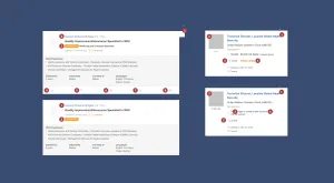
- Around 70% of the patterns of the site were gathered into the Design System Figma's file.
- Most patterns applied in new implementations were shared independently of the product branch and the use of design tokens was consistent in all new designs and implementations.
- We improved UI design delivery speed by avoiding the need of creating low-fidelity mock-ups (we already had high-fidelity assets at our disposal) nor specifying interactions, when already available within the UI toolkit.
- We also had some responsive templates in place, allowing us to work in some projects within their UI context without the need of replicating those pages.
- Freeing our time of UI design gives designers the chance to put more effort into research, resulting in better UX work.
The building process
The start of the Design System was anything but quick. There was no dedicated team to work on it. This meant that we had to find a way of building while still delivering other projects to the rest of the product team without causing any bottlenecks.
Auditing without an audit
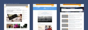
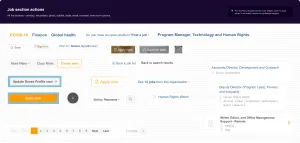
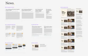
Devex' platform includes different products and the development of those products was done by different teams. At the time, you could clearly find 3 different approaches to the design within the platform: one for news- and marketing-related content, other for the jobs- and recruitment-related content and finally the funding-related content, closer to jobs but with its own unique design patterns.
In order to successfully close that gap, we needed to gain perspective of what visual and functional patterns were alike, which were close enough and which ones were unique to their area. I proposed making a UI audit of the platform to collect all those items and then analyze how they related with each other.
There were too many elements and we already had projects waiting for us in the pipeline. We agreed on 3 actions to be done when facing any UI project:
- When working over an existing page, create components replicating existing reused elements as they are at the moment.
- While creating new elements, look for similar items within that same domain.
- If none of the above applies, discuss with the rest of the team about this addition's value and get agreement, or look for alternatives.
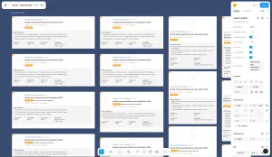
After a year in the job, we had the most common components of the Devex platform scattered along different project files.
Aligning between designers 💬
It took an extra effort between designers to agree on which patterns and components we wanted to keep and extend. We set continuous catch-ups to align and discuss our preferences towards the simplification of existing patterns and replacements for deprecated ones.
As the designer with more experience and technical background, I was leading the project and I spent some time mentoring the other designer about best practices of Design Systems, such as Atomic Design or 8pt grid system or 12-column grid. I also drove several pairing sessions on component creation in Figma, explaining how to use variables, styles and autolayout.
Scaling the pre-existing UI toolkit
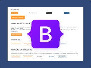
The front-end engineers were working with a UI toolkit based on Bootstrap 5 components. Some of them were basic Bootstrap components modifying the styles to match the Devex brand, others had a wrapper around them to expand their functionality. There were no use cases in place.
We started working by downloading a Bootstrap 5 UI toolkit for Figma and scaled by adapting those assets into our own design system file.
Setting the scope
The front-end team used various technologies: We decided that the system would be applied to new implementations only, using the Bootstrap 5 components as a base.
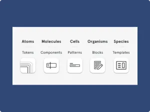
Atomic 2.0
I created a document defining the work process and proposed an Atomic 2.0 approach for being a clear standard applicable to the existing Bootstrap library.
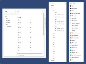
Building design tokens
I began replicating all primitive tokens from our platform and defining them as Figma styles and variables, making them easy to reuse and update in the future.
Getting bigger
We had gathered all tokens and had at our disposition all Bootstrap assets as well as all the components resulting from our on-the-spot auditings. Our next step was to govern all those components and patterns into an understandable and cohesive design language.
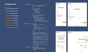
We did so by defining use cases for components, to be used as reference when creating new UIs and as available documentation for the front-end team.
At this stage, I also defined and introduced clear accessibility guidelines as part of the documentation for our components. This included ensuring color contrast levels, ruling language usage for buttons and inputs, defining expected keyboard navigation during hand-off and, along with the engineering team, agreeing upon use of aria-labels and semantic HTML.
We kept all that as part of the Design System file in Figma, given that the front-end would be built differently depending on the technology involved (React or Rails). We had plans to start looking at documentation platforms, including a pilot in Storybook done as part as a hackathon project, but it never came in place as a part of the daily workstream.
Aligning with engineers💬
When it came to aligning with developers, there was some reluctance from some members of the front-end team about how scalable the Design System approach would be. Those were fair concerns given the different technologies involved in the front-end. We agreed to start by introducing only the primitive tokens and keep scaling only in pages using Bootstrap 5.
After a while, our primitives were broadly adopted, so scaling became easier. Also Bootstrap allowed us to modify components to our convenience easily. This enabled us to make modifications on the existing components within some limits. There were also some cases where the patterns were extended beyond their default functionalities, to comply with the use cases that were agreed.
All of this was the result of a long process in which I focused on getting technical buy-in and the system kept growing slowly by proving that the proposed solution was helpful to both design and engineering, as well as maintainable.
Finally, to increase delivery speed and keep adoption high on the design side, we built several responsive templates for the most common pages, to be used as starting points for new projects. This way, we could focus on more complex patterns and research instead of spending time on replicating already existing UIs.