Revamping a job posting flow
Company
Devex
Role
Product Designer
Duration
Q2 & Q3 2024
Project Overview
Devex job posting services had faced a significant decrease in the number of job postings during the last couple of years. My task was to redesign the job posting flow to reduce drop-offs and increase engagement. While this project never got to total fruition, initial results were promising:
- The engagement within the job posting form increased by 28% in the first 50 days after release.
- The number of users starting the job posting process from the updated marketing page increased by 6%.
- Job bundle inquiries tripled during the first month.
Starting Point
The job posting flow had seen a significant decrease in activity over the last couple of years. The main issues we identified were:
- Outdated marketing page: The page wasn't effectively communicating the value of posting a job on Devex.
- A long, intimidating job posting form: The form was a single page with too many fields, which led to high drop-offs.
- Poor error prevention and technical bugs: The form was prone to errors, and users frequently had to refill information.
Research and prioritization
We kicked things off by digging into usage data and benchmarking competitors to spot the biggest problem areas. Since we already knew our two main user types, we reached them through a survey to learn more about the issues they were facing when posting jobs at Devex.
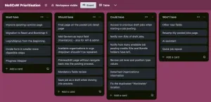
The next step was getting everyone aligned on what success looked like—boosting revenue and making the value of featured jobs more obvious. To keep things focused, I set up a MoSCoW prioritization, mapped out a Risk vs. Effort matrix with the team, and brought the plan to business. Once we had the green light, we got to work.
Doubts around featured jobs value proposition 💬
While we agreed on the main goal being revenue increase, I was hesitant about the business's request to highlight the value of featured job postings.
Job posting in Devex was already one of the most expensive amongst its competitors and the decrease was more notable for users who didn't have a recruiter account and whose average number of jobs posted per user was quite low. That didn't make sense to me, so I proposed to focus on engagement rather than direct revenue, since the numbers in other business lines were performing well.
From my perspective, asking those users to pay more rather than investing in increasing engagement for those users, seemed like a strategy that could backfire. Still, business was confident about the value proposition, so we went ahead with the initiative.
Designing the new job posting flow
During the planification discussions, we agreed on prioritizing migrating tasks because although probably not the most impactful, those were the ones that enabled us to keep moving forward while reducing the technical debt and applying patterns from the design system. We completed the following initiatives:
Review communications
We noticed there were a lot of unknowns around what interactions were part of the job posting flow out of the Devex website. I teamed-up with the PO, Marketing manager and the VP of Product to map those up and define a new version of mailing milestones through the funnel.
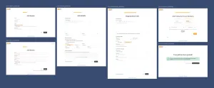
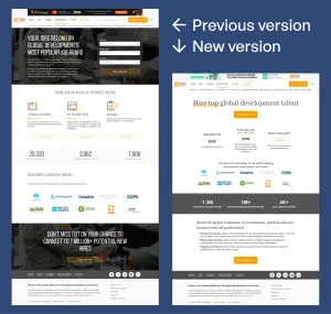
Redesigning the marketing page
The first step was overhauling the marketing page, which was outdated and not conveying the right message. I proposed this as the first step for 3 main reasons:
- Being mostly static content, it was a simpler and isolated change.
- The higher in the funnel you make a change, the more people it will reach: This was the first step of the process for non-recruiter job posters.
- This could be addressed while the most critical bugs of the posting form were fixed.
I focused on simplifying the design, making the value proposition clearer, and we gave more relevance to the feature jobs, as per business request. This redesign led to a 6% increase in users who started the job posting process, indicating that the updated page was more engaging and tripled the number of job bundle inquiries.
CTA location rationale 💬
For comparing available options of job posting, the card approach is a good way to showcase them. However, it is quite standard that "pricing" cards get displayed with a CTA within. Having a separate button for it is likely to create confusion. I decided to have the main action separated from the cards, since our payment pages didn't allow for item preselection. This decision was made with the idea of moving it into the cards at some point in the future, after working in the payment component.
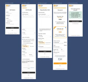
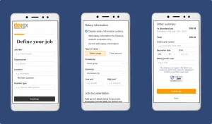
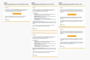
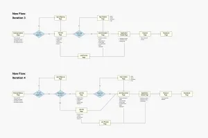
Breaking down the job form
The single-page job form was intimidating, so we split it into smaller, more digestible steps. I proposed several iterations to move from the existing flow to the new one. Since the migration was a big effort and it was already on the roadmap, we jumped directly into the third iteration but without detaching the organization info as a conditional step.
All the changes were proposed as part of an iterative process. By doing these changes, users would go through the posting form with less cognitive load and more control (jobs are now saved as draft after each step). But there are also counterparts: right now and until a new editing page is created, the process of editing a job is likely to be more painful than it was. Anyhow, the new structure proved easier to navigate and drove a 28% increase in form engagement.
Pending actions and external factors
It's worth noting that a big part of our recruiter accounts were held by USAID contractors. This group played a significant role in the success of the job posting flow, and up until the freeze ordered by the Trump administration in February 2025, we were recording the best engagement numbers in 6 months.
These had been the starting steps towards a more engaging job posting flow. However, they were likely not enough to solve the main problem. We had anecdotal evidence of some fields not having the required values recruiters were looking for, or some other missing information (such as language or skills).
In my opinion, these changes put together would have a more effective impact on keeping job posting users engaged with Devex, but they had ramifications into other products of the platform. Because of that, they were not part of these first initiatives.
The multi-product trap 💬
There were many different products living together within the Devex platform, but those were usually not connected between them. To me, that was a lost opportunity to create more engaging experiences for all user personas at Devex.
I understand the technical risks of having partial content from many places in each product, but by cross-referencing those data points, we could have created more relevant content for the users and increased engagement.