

Design Process at Devex
Company
Devex
Role
Product Designer
Duration
2022 - 2025
Project Overview
Over the 3 years I worked at Devex, we transformed how the product team approached design. As the most senior designer in the team and without a clear work structure, I led a set of changes that would enable a series of improvements:
- More consistent delivery through actionable items and iterations.
- Faster feedback loops with asynchronous collaboration.
- Centralized assets in Figma, improving visibility and accessibility.
- Increased design consistency with an internal Design System.
- Better communication and understanding of design work.
Starting point
Before I joined, there had been a series of conversations within the company proposing to start taking steps towards a higher level of design maturity. The new hirings I was part of were done with the idea of shifting the culture into a more user-centric approach, bringing design closer to business and the rest of stakeholders.
Some of the issues we identified were:
- Design was embedded in the development process and handled the implementation: This caused frictions and bottlenecks.
- Research was sporadic and many projects lacked proper discovery and ideation stages: Design work at Devex was too busy with creating and developing requested proposals that they didn't have time for research.
- Business insights were coming from just 2 stakeholders: This left out other relevant voices.
- No centralized documentation: Knowledge was scattered and we had no way to know whether existing documentation or proposals were being followed, making it virtually useless.
- Design consistency was lacking across the product: by working in silos, design elements ended up not aligned nor reused across the product.
Collaboration in the product team 💬
Devex's design culture had a tendency to design by committee, and friction between design and development was not uncommon. While the culture gradually shifted, these issues never fully disappeared. The product team was always open to feedback, with design receiving more input than other disciplines. To manage this, I focused on listening, explaining decisions, and ensuring clarity on final calls, always feeling supported by my peers and managers.
Achieving change
The first months were spent getting to know the team and the product and working on projects following the old process, which helped me understand the state of the design process. After that, I started working on some of the initiatives I had in mind to address the more relevant pain points.
Increasing the velocity
Product team velocity was a challenge, with large project scopes slowing things down. To tackle this, I started breaking projects into iterations, structuring Design Critiques around feasibility. While this helped, some iterations still felt too heavy, so I shifted to actionable items, making it easier to prioritize based on impact vs. effort. I teamed up with our PO to leverage asynchronous feedback and streamlined communication, making the process even more efficient.
Explaining design work
With designers no longer handling UI implementation, we needed to redefine how design work was shared with developers while also improving visibility for business stakeholders. Design Critique sessions provided a structured space for feedback, keeping refinement meetings focused and ensuring alignment with the development team.
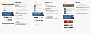
At the same time, I introduced process flows to clarify deliverables, touchpoints, and stakeholder involvement, setting clear expectations for business teams. These flows weren't rigid rules but served as a shared framework, making the design process more transparent and improving communication across teams.
Adoption of the design process 💬
The design process was meant to set expectations, not enforce rigid rules. Some steps, like the Project Agreement, were rarely used due to shifting priorities. It structure also evolved to a recursive model from the ideation and delivery phases once we moved into actionable items. In any case, the adoption of a design process improved alignment with other stakeholders and follow-ups on design work.
Centralizing assets
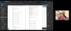
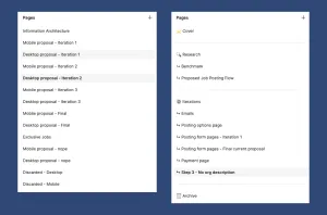
We established Figma as our single source of truth, replacing the messy system of scattered Google Drive folders. Everything—from mock-ups and prototypes to research and feedback was either built in or linked to a single Figma file. To keep things in order, I proposed a file structure that would make it easier to track proposals, iterate on them and collaborate. The structure evolved naturally over time, adapting to our needs as we kept refining the process. With help from our PO, we made Figma comments the de-facto way of giving feedback within the product team.
More data means better decisions
During my first meeting with the VP of Product, I highlighted how most design projects lacked dedicated time for research and ideation. To address this, we began incorporating usage data at the start of every project, providing tangible evidence of design impact. Business priorities sometimes overran research, but we made sure to back every decision with actual data. We also started tracking performance after launches and made A/B testing a go-to for smaller projects.
The qualitative gap 💬
When I joined Devex, the go-to source for qualitative data was a limited Hotjar membership that barely covered enough traffic to offer meaningful insights. I took the lead in researching better alternatives, focusing on tools that would allow us to properly set up funnels and access heatmaps and session recordings. We ultimately switched to Microsoft Clarity, which provided more useful insights in these areas.
We also conducted punctual user interviews, joined onboarding sessions, and worked closely with the support team, which was an invaluable source of qualitative data. Still, the gap remained. Despite our efforts and repeated requests for resources, a proper qualitative research strategy was never put in place.
Making Devex look like Devex
Even with a UI toolkit in place, without alignment, design varied between features. To fix this, we established a periodical catch-up and pairing sessions between designers. These gave us alignment to take decisions as a team instead of individuals. From there, we started working on scaling the UI toolkit to a Design System. This not only improved efficiency but also made the product more cohesive, laying the foundations of a future redesign.

